Rabu, 14 Desember 2011

Eigen Value (λ)

Pada kuliah statistika, kita sering mendengar istilah “EIGEN VALUE”. Apa sebenarnya yang dimaksud dengan eigen value? Eigen value sering diartikan dengan akar ciri. dalam bahasa yang lebih mudah eigen value merupakan suatu nilai yang menunjukkan seberapa besar pengaruh suatu variabel terhadap pembentukan karakteristik sebuah vektor atau matriks. eigen value dinotasikan dengan λ.

Jika hanya sekedar mengerti bagaimana rumus dan cara penghitungan eigen value, tentu kita tidak akan pernah paham bagaimana interpretasi dari sebuah angka eigen value. Saya akan mengambil contoh satu mangkuk masakan “soto madura”…hmmm…enaknya… Jika ada 10 orang ditanya mengenai rasa soto tersebut, dan diminta menyebutkan bumbu apa kira-kira yang paling terasa dari soto itu, maka semua orang pasti menyebutkan “garam”. karena garam memberikan rasa asin yang tentu saja dimiliki oleh soto tersebut. Tapi mungkin hanya 1 atau dua orang yang menyebutkan “serai” karena serai adalah bumbu khas yang dimiliki soto yang mungkin tidak dimiliki masakan lain. Atau kunyit…

Nah, sekarang kalau diminta menebak, kira-kira garam memiliki nilai λ yang paling besar atau paling kecil? ya..garam memiliki λ paling kecil. dan yang memiliki λ paling besar adalah yang memberikan karakteristik atau ciri paling kuat pada soto. dan orang akan memberikan jawaban berbeda-beda sesuai dengan indra perasanya masing-masing. sederhana bukan?? sekarang kita tau makna dari sebuah ukuran statistik “eigen value”

inspirasi ini diberikan oleh dosen saya di ITS, yang membuat saya banyak mengerti filosofi dari sebuah ukuran statistik. thanx to Drs. Kresnayana Yahya, M.Sc..

sumber : http://nuvie81.wordpress.com/

English version:

In college, we often hear the term "Eigen VALUE". What exactly is meant by eigen value? Eigen value is often defined by the root traits. As a term eigen value is a value that indicates how much influence on the formation of a variable characteristic of a vector or matrix. eigen value denoted by λ.

If we just only understand how the formula and calculation of eigen values​​, of course we will never understand how the interpretation of a number eigen value. I'll take the example of one bowl dish "soto madura" (or chicken soup) ... hmmm ... delicious ... If there 10 people were asked about the soup flavors, seasonings and asked to name what about the most intriquing things from the soup, then everyone would say "salt". because salt gives a salty taste which of course is owned by the soup. But maybe only one or two people mention "lemon grass" because lemongrass is owned by a typical spice soup that may not have other dishes. Or turmeric ...

Now, if we have to guess, about a salt having the largest value of λ or the smallest? yes .. salt has the smallest λ. and which has the greatest λ is the characteristic or trait that gives the most powerful sense on the soup. and people will give different answers according to the sense of feeling on each. isn't simple? Now we know the meaning of a statistical measure of "eigen value"

inspiration was given by my lecturer at ITS, which makes me a lot to understand the philosophy of a statistical measure. thanx to Drs. Kresnayana Yahya, M.Sc..


source : http://nuvie81.wordpress.com/

Jumat, 02 Desember 2011

Memperkirakan kesuksesan Film Box Office: Menggunakan Neural Networks

"Apa? Membuat film harus menggunakan regresi logistik? Pusing amat?"

Tenang dulu, bukan berarti membuat film harus ngejelimet dengan angka, tetapi ternyata jika industri dimanapun baik budaya, hiburan bahkan manufaktur, peran metoda statistik bisa menjadi alat bantu yang menyenangkan ^_^.

Di negara maju, setiap aspek industrinya tidak lepas dari peran riset dan pengembangan. Data dan analisis merupakan alat penting sebagai salah satu feedback selain dari hasil keuangan (laba-rugi). Salah satunya industri hiburan, dalam hal ini adalah industri film. Kepentingan analisis digunakan sebagai mengetahui atau memetakan sebuah industri. Contohnya bisa terlihat pada jurnal yang akan saya bahas kali ini,


Judul: "Predicting box-office success of motion pictures with neural networks"
Karya: Ramesh Sharda and Dursun Delen
Tahun: 2006
Penerbit: Elsevier.com


Bagian pemetaan indsutri Amerika dan latar belakang mengapa penelitian ini dilakukan sepertinya tidak perlu saya ceritakan panjang lebar, silahkan baca sendiri jurnalnya (mau jurnalnya? hub kami ^_^). Intinya penelitian ini dilakukan untuk bisa memberikan masukkan pada producer film untuk bisa mengambil keputusan terhadap bagaimana mereka bisa membuat film yang akan menghasilkan kesuksesan.

Okeh, kita masuk kebagian serunya ya ^_^, bagian tools! Dari judulnya jurnal ini menggunakan neural networks, namun sebenarnya neural networks tersebut merupakan pengembangan dari model-model statistik seperti regresi logistik atau diskriminan analysis.

Apa sih Neural Networks? Neural networks adalah analisis jaringan antara variabel-variabel. Secara sederhana model hubungan antar variabel dalam statistik adalah Regresi. Namun dalam penelitian ini data yang digunakan adalah data diskrit dan qualitative dimana setiap variable saling berhubungan satu sama lain, maka neural network digunakan untuk mengukur variabel yang mempengaruhi kesuksesan sebuah film.

Pertama-tama yang harus dilakukan adalah membuat hipotesa awal. Dalam hal ini kita membuat model neural networknya. Dengan melakukan penelitian awal dan diskusi terhadap para ahli maka diperoleh model berikut
Dari model tersebut terdapat 7 variabel yang akan mempengaruhi sebuah kesuksesan film. Kesuksesan tersebut dibagi menjadi 9 kelas (output).


Berikut variabel yang akan diukur:


Kemudian dilakukan observasi terhadap data-data setiap tahunnya selama 5 tahun untuk mengetahui bagimana nilai persentase dari variabel-variabel tersebut dalam mempengaruhi performance film. Kemudian dikelompokkan film mana masuk kelas mana. Kelompok tersebut dibentuk dalam sebuah matriks. Jika film tersebut diprediksikan akan masuk kelas "tidak laku" dan dari data menyatakan memang film tersebut "tidak laku" maka hal tersebut diistilahkan sebagai tepat (bingo). Jika tidak maka disebut setidaknya hampir mendekati tepat (1-away).

Dari data matriks selama 5 tahun (dapat dilihat di jurnal), kemudian dengan neural networks dan atau alat statistik yang lainnya diperoleh sebuah prediksi bingo dan 1-away, sebagai berikut:


Dari hasil di atas terlihat bahwa standar deviasi terhadap data 1-away yang paling kecil adalah dengan menggunakan Neural Networks. Artinya Neural Network merupakan alat yang paling tepat untuk memprediksikan kesuksesan suatu produk dalam bidang yang memiliki banyak faktor qualitative seperti sosial dan hiburan.

Setelah didapatkan model menggunakan neural networks selanjutnya dilakukan sensitivitas analisis. Gunanya untuk menilai apakah variable-variable tersebut secara mampu mempengaruhi kesuksesan sebuah film. Hasilnya ternyata hal yang paling mempengaruhi kesuksesan film adalah jumlah layar, efek visual teknologi, dan artis terkenal. Dimana model neural network tersebut dapat memprediksi sebesar 75% akan sukses masuk kelas tertentu sesuai perkiraan producer.

Sekian penjelasan mengenai penggunan analisis pada sebuah industri hiburan yang katanya tabu jika disandingkan dengan science ^_^..

Gimana seru kan? model tersebut juga bisa digunakan untuk industri musik, televisi dan lainnya. Tapi di Indonesia gimana? Variable apakah yang mempengaruhi kesuksesan film? Nah, itu belum pernah ada yang melakukannya. ^_^

Semoga tulisan ini mengispirasi para pembaca yang sedang melakukan penelitian skripsi atau thesis. Silahkan ditanyakan pada kami kalau ada yang kurang jelas dan ingin bantuan untuk mengejarkan analisis ini pada kasus Indonesia atau dimanapun, dengan senang hati kami akan membantu ^_^...

Senin, 14 November 2011

Sekilas Sampel

Sampel merupakan suatu hal yang wajib dilibatkan ketika kita melakukan suatu riset. Berapa banyak sampel yang harus diambil, berapa persen proporsinya, dan berapa presisi yang harus ditentukan, merupakan pertanyaan-pertanyaan yang selalu muncul dalam pengambilan sampel.

Secara umum, syarat sampel yang baik adalah yang dapat mewakili sebanyak mungkin karakteristik populasi. Dengan kata lain, sampel tersebut harus valid, artinya mengukur sesuatu yang harusnya diukur. Tentunya jika ingin meneliti tingkat kecerdasan anak sma tingkat jawa barat, kita tidak hanya meneliti yang sma di kota bandung saja, ya kan.

Nah, ada 2 hal yang wajib diperhatikan untuk mencapai sampel yang valid, yaitu akurasi dan presisi.

Akurasi dapat diartikan tingkat ketidakadaan bias dalam sampel. Agar sampel dapat memprediksi dengan baik suatu populasi, sampel harus mempunyai selengkap mungkin karakteristik populasi. Dan perlu diketahui bahwa akurasi prediktibilitas dari suatu sampel tidak bisa dijamin dengan banyaknya sampel.

Presisi. Jika berbicara mengenai presisi, artinya kita sudah berbicara mengenai estimasi. Presisi mengacu pada persoalan sedekat mana statistik kita dengan parameternya. Contoh, hasil survei berdasarkan sampel yang kita punya, rata-rata pendapatan orang indonesia 5juta, sedangkn berdasarkan perhitungan badan pemerintah yg notabene hasil sensus, rata-rata pendapatan orang Indonesia adalah 5,2 juta. Nah  ada perbedaan  0,2 juta dalam estimasi kita yang disebut sampling error. Semakin kecil perbedaan tersebut, semakin tinggi tingkat presisi sampel kita. Presisi sendiri berkaitan dengan interval konfidensi (CI), misalnya CI kita 4,75juta - 5,25juta. Karena statistik kita 5juta, maka perbedaan 0,25juta dari nilai estimasi kita disebut sebagai presisi. Dan perlu diketahui bahwa dalam estimasi, ada juga yang disebut confidence level atau tingkat kepercayaan, dengan besaran biasanya 90%, 95%, atau 99%, yang berarti bahwa dengan besaran tingkat kepercayaan tersebut, kita yakin bahwa rata-rata populasi berada pada selang interval konfidensi yang kita buat. Dianggap bahwa semakin lebar selang kepercayaan, semakin jelek estimasi tersebut (poor estimate). Tentunya setiap peneliti menginginkan selang kepercayaan yang sempit, yang berarti  balik lagi ke tingkat presisinya yang harus tinggi. Tapi masalahnya adalah parameter populasi tak pernah diketahui,  so bagaimana bisa kita menentukan presisi?

Sebetulnya ukuran sampel bergantung pada derajat keseragaman, presisi yang dikehendaki, rencana analisis data dan fasilitas yang tersedia (Singarimbun dan Effendi, 1982). Bagaimana cara menentukan presisi, banyak hal yang turut mempengaruhi, misalnya masalah waktu, objek penelitiannya apa, dan biasanya yang paling paling mempengaruhi adalah masalah biaya. :p.

 Presisi diukur oleh simpangan baku (standard error). Makin kecil perbedaan di antara simpangan baku yang diperoleh dari sampel dengan simpangan baku dari populasi, makin tinggi pula tingkat presisinya. Walau tidak selamanya, tingkat presisi mungkin  bisa meningkat dengan cara menambahkan jumlah sampel, karena kesalahan mungkin bisa berkurang kalau jumlah sampelnya ditambah ( Kerlinger, 1973 ).

Akurasi dan presisi, gambaran lebih jelasnya bisa dilihat disini.

Tentunya jika kita mencoba idealis, dimana kita menginginkan hasil survei dengan interval konfidensi yang sempit, maka kita setting tingkat presisi yang tinggi pula. Yang pastinya dengan tingkat presisi yang tinggi tersebut kita harus siap dengan jumlah sampel yang cukup besar, karena ukuran sampel berbanding terbalik dengan kuadrat presisi.

L. Naing, T. Winn, B.N. Rusli mengutarakan artikel yang cukup bagus mengenai perhitungan presisi ini. Saya copas aja semuanya disini ya :D.

 Determining Precision (d)

What is the appropriate precision for prevalence studies? Most of the books or guides show the steps to calculate the sample size but there is no definite recommendation for appropriate d. Investigators generally ends up with the ball-park figures of the study sizes usually based on their limitations such as financial resources, time or availability of subjects. However, we should calculate the sample size with a reasonable or acceptable precision and then allowing for other limitations. In our experience, it is appropriate to have a precision of 5% if the prevalence of the disease is going to be between 10% and 90%.
This precision will give the width of 95% CI as 10% (e.g. 30% to 40%, or 60% to 70%). However, when the prevalence is going to be below 10% or more than 90%, the precision of 5% seems to be inappropriate. For example, if the prevalence is 1% (in a rare disease) the precision of 5% is obviously crude and it may cause
problems. The obvious problem is that 95% CIs of the estimated prevalence will end up with irrelevant negative lower-bound values or larger than 1 upper bound values as seen in the Table 1. Therefore, we recommend d as a half of P if P is below 0.1 (10%) and if P is above 0.9 (90%), d can be {0.5(1-P)}. For example, if P is 0.04, investigators may use d=0.02, and if P is 0.98, we recommend d=0.01. Figure 1 is plotted with this recommendation. Investigators may also select a smaller precision than what we suggest if they wish.However, if there is a resource limitation,investigators may use a larger d. In case of apreliminary study, investigators may use a larger d (e.g. >10%). However, justification for the selection of d should be stated clearly (e.g. limitation of resources) in their research proposal so that reviewers will be well informed. In addition, the larger d should meet the assumption of normal approximation that we will discuss later.


Artikel lengkapnya, unduh disini nih..

Intinya adalah, dalam menentukan jumlah sampel, batasan yang harus diperhatikan:
  • Tentukan tujuan risetnya
  • Tentukan respondennya, dari sini kita bisa tau pake sampling apa, random atau non random, kalo random, pake metode sampling random apa, kalo non random pake metode sampling non random apa
  • Bikin kerangka samplingnya
  • Merunut ke tujuan survei, pastinya kita udah tau responden di wilayah mana yg mau disurvei..inget musti valid..
  • Merunut ke tujuan survei lagi, pastinya kita udah tau berapa lama waktu yang kita punya untuk riset kita, begitupun dengan dana yang kita punyai. Jika Anda udah menentukan jumlah sampel, dan ternyata dengan waktu atau dana yang Anda punya tidak cukup, maka mungkin sampelnya harus dikurangin, dengan cara menurunkan tingkat presisinya. Jika ternyata sample yang Anda ambil bahkan kurang dari sepertiganya, it's fine, asalkan dapat dipertanggungjawabkan, dan pastinya langkah pengambilan sampel sesuai dengan kaidah statistik plus sampel Anda representatif :D.

Selasa, 11 Oktober 2011

Introduction of multivariat - Dasar Statistik

Sebelum masuk ke multivariat yang sebenarnya, kita harus tahu dasar sebelumnya. Maka yang berikut ini adalah intro statistik:

- Statistic itu sebenarnya berasal dari kata apa ayoo?? (aku yg backgroundnya jurusan statistic seumur-umur belum pernah peduli dengan asal usul kata Statistic. Begitu juga dosen-dosen terdahulu ku, ^_^)
Statistik berasal dari kata statista, bahasa italia yang berarti state person. Seseorang di suatu lembaga yang bertugas untuk mengambil keputusan. Orang tersebut menggunakan data dan informasi untuk mendukung keputusannya tersebut.

- Lalu mengapa kita harus belajar statistik?
Agar kita bisa mengambil keputusan yang valid atau setidaknya memiliki dasar yang jelas, yaitu data atau informasi. Data dan informasi yang ada pasti tidak ada yang sama. Semuanya memiliki variabilitas yang heterogen. Karena itu ada statistik.

- Lompat sedikit ke conjoint analysis. Apa sih Conjoint analysis (dosenku yang sekarang adalah ahlinya conjoint. dia pernah menerbitkan buku khusus menengai conjoint. mau? call me ^_^).
Conjoint analisis bisa digunakan pada bidang marketing riset gunanya untuk mengetahui preferensi konsumen.

- Sementara itu, Analisa multivariat itu apa?
Merupakan, Statistika method dimana digunakan untuk data yang multivariat kemudian diolah secara simultan.

- Tunggu dulu, sebenarnya variat itu apa?
Variat itu adalah gabungan dari beberapa variable. Tapi tidak jarang orang juga menamakan variat adalah variable.

Nah segitu aja deh kuliah multivariat -intro ^_^

Disadur dari http://ilma-ie.blogspot.com/2011/09/introduction-of-multivariat-basic.html 
oleh ilma fathnurfirda

Selasa, 10 Mei 2011

I HATE STATISTICS

Just try to google "I hate Statistics", surprisingly there's a huge of it. Apparently, statistics  is so popular (lol). There's even a group on facebook named I HATE STATISTICS. Wow!
Let's take a look why those people do so.

 Jovan
I, for one, hate statistics for the following reasons:
- It’s pseudomathematics. It dresses up as a concise set of theories and methods, when these would more properly be referred to as cookbooks.
- It’s simplistic. It gives a false sense of understanding about complex systems where no understanding exists. It prevents people from searching for mechanistic explanations that could indeed provide valuable insights.
- It’s self-adulatory. Its practitioners have the courage to call every little possible way to plot data a “tool” or a “method”.
- It’s too widespread. Most college programs that lack the most basic mathematics have their statistics courses (humanities and sciences), which helps spread misconceptions and misuse.
 (http://flowingdata.com)

Lil_Fig_Newton
So sleepy... three more chapters to read... I HATE stats. WORST SUBJECT EVER! Why oh why did I choose to take it the last semester of my senior year??? Who gives a shit about the null hypothesis???

I'm cycling between extreme bouts of sleepiness and horrible anxiety about my exam, which is in 4 hours (holy fuck, how did time go by so fast?!?!) I need to make a 66 on the final to pass. Please cross your fingers, say prayers, or what ever thing you do for good luck. I have to pass this class to graduate and it is my next to last final. OK, must study more now. More info to CRAM into my exhausted brain.
(http://www.atforumz.com)

Paul Dalton
 There- do you understand? I don’t for what it is worth, but I accept that it is true. I have to do that a lot in my work. I have never been really good with math, yet my work requires looking at statistics. Concepts like confidence intervals and power equations are beyond my ability to truly understand- but I look at them and use them in my work all the time. Is that a weakness for me as an treatment activist- probably.
And that is why I hate statistics.
(http://blogs.poz.com)

Deb
I agree that most people think the field should be renamed "sadistics" but I am not 100% sure why it's so despised.
(http://www.stat.columbia.edu)


Cheryl 
Statistics does suck. It is useless garbage that I will NEVER use. I am 54 years old and I have NEVER used it at work or even running my own business for 18+ years, so what the hell do I need if for now? I have to take it to graduate with my degree.
I bore two boys, raised them, I have undergone open heart surgery and I have NEVER experienced the level of frustration and pain as I have had in this statistics class.
The textbook is POORLY written and the online venue? DON’T have anything to do with Pearson!
I would rather eat glass, drive a pencil through my eye AND walk on coals then to put up with this crap.
There has been nothing my whole life, that could not be figured out by using just addtion, subtraction, multiplying and dividing. The plus? No STUPID rules, that if this happens, then use this or if there is this do this. PLAAEEEEZE! Who thought this junk up????
(http://flowingdata.com)


Patrick 
I hate statistics for a number of reasons:
- My intro professor was without a doubt the worst professor I have ever had. This was essentially intro to statistics for non-statisticians and she took powerpoint slides right from the textbook and threw them up on a screen. Needless to say, it was absolutely useless. Then, during the lab session, she was trying to teach us R without giving us a good background on the concepts. Thankfully, I found a book that barely got me through the class and gave me a great appreciation for some of the concepts. The worst professors are those who lecture for 90 minutes, then say “Any questions.” At which point you don’t even know where to start because s/he lost you in minute two and didn’t care. This was stats for me.
(http://flowingdata.com)


actually all of my CS professors were pretty dynamic. It’s the projects I didn’t like :)
(http://flowingdata.com)


Steve
I may have mentioned it before, but statistics is the worst subject ever to be inflicted on a student. It's even worse than maths.
(http://thedeskinthecorner.blogspot.com)

~Alison
I'm half way thru my online statistics course & I too hate it. It makes no sense to me. i can do the work & give them an answer, but I'm not really learning it. Thankfully only 2 tests left.
It does really stink though. It's confusing to me. Maybe taking it online was not a good idea. it might hve made more sense if I had a teacher lecturing on the material.
(http://allnurses.com)

Jon Peltier
I don’t think people dislike statistics because they are bad at math (though they may be bad at math).
I don’t think the uncertainty is the reason, or the order it imposes.
I think the major reason people dislike statistics is that it was poorly taught in whatever classes they took. Perhaps the instructor didn’t get it, or didn’t do the examples well.
A related reason that people don’t like statistics is that any examples they ever saw were not relevant to something they understood or cared about.
I wasn’t wild about the classroom statistics I had, but what I’ve learned since then has been interesting.
(http://flowingdata.com)

Tony
It sucks soo bad. I get headaches doing this crap (http://amplicate.com/hate/statistics)

So, why do you think you should love statistics? :D 


Minggu, 08 Mei 2011

How to Use the Likert Scale in Statistical Analysis

A Likert scale (pronounced /ˈlɪkərt/,[1] also /ˈlaɪkərt/) is a psychometric scale commonly used in questionnaires, and is the most widely used scale in survey research, such that the term is often used interchangeably with rating scale even though the two are not synonymous. When responding to a Likert questionnaire item, respondents specify their level of agreement to a statement. The scale is named after its inventor, psychologist Rensis Likert.[2]
Sample question presented using a five-point Likert item

An important distinction must be made between a Likert scale and a Likert item. The Likert scale is the sum of responses on several Likert items. Because Likert items are often accompanied by a visual analog scale (e.g., a horizontal line, on which a subject indicates his or her response by circling or checking tick-marks), the items are sometimes called scales themselves. This is the source of much confusion; it is better, therefore, to reserve the term Likert scale to apply to the summated scale, and Likert item to refer to an individual item.

A Likert item is simply a statement which the respondent is asked to evaluate according to any kind of subjective or objective criteria; generally the level of agreement or disagreement is measured. Often five ordered response levels are used, although many psychometricians advocate using seven or nine levels; a recent empirical study[3] found that a 5- or 7- point scale may produce slightly higher mean scores relative to the highest possible attainable score, compared to those produced from a 10-point scale, and this difference was statistically significant. In terms of the other data characteristics, there was very little difference among the scale formats in terms of variation about the mean, skewness or kurtosis.

The format of a typical five-level Likert item is:

   1. Strongly disagree
   2. Disagree
   3. Neither agree nor disagree
   4. Agree
   5. Strongly agree

Likert scaling is a bipolar scaling method, measuring either positive or negative response to a statement. Sometimes a four-point scale is used; this is a forced choice method[citation needed] since the middle option of "Neither agree nor disagree" is not available.

Likert scales may be subject to distortion from several causes. Respondents may avoid using extreme response categories (central tendency bias); agree with statements as presented (acquiescence bias); or try to portray themselves or their organization in a more favorable light (social desirability bias). Designing a scale with balanced keying (an equal number of positive and negative statements) can obviate the problem of acquiescence bias, since acquiescence on positively keyed items will balance acquiescence on negatively keyed items, but central tendency and social desirability are somewhat more problematic.
Scoring and analysis

After the questionnaire is completed, each item may be analyzed separately or in some cases item responses may be summed to create a score for a group of items. Hence, Likert scales are often called summative scales.

Whether individual Likert items can be considered as interval-level data, or whether they should be considered merely ordered-categorical data is the subject of disagreement. Many regard such items only as ordinal data, because, especially when using only five levels, one cannot assume that respondents perceive all pairs of adjacent levels as equidistant. On the other hand, often (as in the example above) the wording of response levels clearly implies a symmetry of response levels about a middle category; at the very least, such an item would fall between ordinal- and interval-level measurement; to treat it as merely ordinal would lose information. Further, if the item is accompanied by a visual analog scale, where equal spacing of response levels is clearly indicated, the argument for treating it as interval-level data is even stronger.

When treated as ordinal data, Likert responses can be collated into bar charts, central tendency summarised by the median or the mode (but some would say not the mean), dispersion summarised by the range across quartiles (but some would say not the standard deviation), or analyzed using non-parametric tests, e.g. chi-square test, Mann–Whitney test, Wilcoxon signed-rank test, or Kruskal–Wallis test.[4] Parametric analysis of ordinary averages of Likert scale data is also justifiable by the Central Limit Theorem, although some would disagree that ordinary averages should be used for Likert scale data.

Responses to several Likert questions may be summed, providing that all questions use the same Likert scale and that the scale is a defendable approximation to an interval scale, in which case they may be treated as interval data measuring a latent variable. If the summed responses fulfill these assumptions, parametric statistical tests such as the analysis of variance can be applied. These can be applied only when more than 5 Likert questions are summed.[citation needed]

Data from Likert scales are sometimes reduced to the nominal level by combining all agree and disagree responses into two categories of "accept" and "reject". The chi-square, Cochran Q, or McNemar test are common statistical procedures used after this transformation.

Consensus based assessment (CBA) can be used to create an objective standard for Likert scales in domains where no generally accepted standard or objective standard exists. Consensus based assessment (CBA) can be used to refine or even validate generally accepted standards.
Level of measurement

The five response categories are often believed to represent an Interval level of measurement. But this can only be the case if the intervals between the scale points correspond to empirical observations in a metric sense. In fact, there may also appear phenomena which even question the ordinal scale level. For example, in a set of items A,B,C rated with a Likert scale circular relations like A>B, B>C and C>A can appear. This violates the axiom of transitivity for the ordinal scale.
Rasch model

Likert scale data can, in principle, be used as a basis for obtaining interval level estimates on a continuum by applying the polytomous Rasch model, when data can be obtained that fit this model. In addition, the polytomous Rasch model permits testing of the hypothesis that the statements reflect increasing levels of an attitude or trait, as intended. For example, application of the model often indicates that the neutral category does not represent a level of attitude or trait between the disagree and agree categories.

Again, not every set of Likert scaled items can be used for Rasch measurement. The data has to be thoroughly checked to fulfill the strict formal axioms of the model.
Pronunciation

Rensis Likert, the developer of the scale, pronounced his name 'lick-urt' with a short "i" sound.[5][6] It has been claimed that Likert's name "is among the most mispronounced in [the] field."[7] Although many people use the long "i" variant ('lie-kurt'), those who attempt to stay true to Dr. Likert's pronunciation use the short "i" pronunciation ('lick-urt').

From Wikipedia, the free encyclopedia


The Likert scale is commonly used in survey research. It is often used to measure respondents' attitudes by asking the extent to which they agree or disagree with a particular question or statement. A typical scale might be "strongly agree, agree, not sure/undecided, disagree, strongly disagree." On the surface, survey data using the Likert scale may seem easy to analyze, but there are important issues for a data analyst to consider.


Instructions

   1. Get your data ready for analysis by coding the responses. For example, let's say you have a survey that asks respondents whether they agree or disagree with a set of positions in a political party's platform. Each position is one survey question, and the scale uses the following responses: Strongly agree, agree, neutral, disagree, strongly disagree. In this example, we'll code the responses accordingly: Strongly disagree = 1, disagree = 2, neutral = 3, agree = 4, strongly agree = 5.
   2. Remember to differentiate between ordinal and interval data, as the two types require different analytical approaches. If the data are ordinal, we can say that one score is higher than another. We cannot say how much higher, as we can with interval data, which tell you the distance between two points. Here is the pitfall with the Likert scale: many researchers will treat it as an interval scale. This assumes that the differences between each response are equal in distance. The truth is that the Likert scale does not tell us that. In our example here, it only tells us that the people with higher-numbered responses are more in agreement with the party's positions than those with the lower-numbered responses.
   3. Begin analyzing your Likert scale data with descriptive statistics. Although it may be tempting, resist the urge to take the numeric responses and compute a mean. Adding a response of "strongly agree" (5) to two responses of "disagree" (2) would give us a mean of 4, but what is the significance of that number? Fortunately, there are other measures of central tendency we can use besides the mean. With Likert scale data, the best measure to use is the mode, or the most frequent response. This makes the survey results much easier for the analyst (not to mention the audience for your presentation or report) to interpret. You also can display the distribution of responses (percentages that agree, disagree, etc.) in a graphic, such as a bar chart, with one bar for each response category.
   4. Proceed next to inferential techniques, which test hypotheses posed by researchers. There are many approaches available, and the best one depends on the nature of your study and the questions you are trying to answer. A popular approach is to analyze responses using analysis of variance techniques, such as the Mann Whitney or Kruskal Wallis test. Suppose in our example we wanted to analyze responses to questions on foreign policy positions with ethnicity as the independent variable. Let's say our data includes responses from Anglo, African-American, and Hispanic respondents, so we could analyze responses among the three groups of respondents using the Kruskal Wallis test of variance.
   5. Simplify your survey data further by combining the four response categories (e.g., strongly agree, agree, disagree, strongly disagree) into two nominal categories, such as agree/disagree, accept/reject, etc.). This offers other analysis possibilities. The chi square test is one approach for analyzing the data in this way.


Read more: How to Use the Likert Scale in Statistical Analysis | eHow.com http://www.ehow.com/how_4855078_use-likert-scale-statistical-analysis.html#ixzz1LGrJsRUS


Opinion:

There's a huge debate ongoing in the social / behavioral sciences over whether Likert scales should be treated as ordinal or interval.


Count me as one who thinks it's OK to treat them as interval.


I would analyze the data both ways - with chi-square and with ANOVA, and see how it turns out - if the outcomes are the same, you're all set. If you get something different with each method, then you have something interesting...


Overall, you can treat the scales as interval and run methods that compare means, such as ANOVA. The scales are close enough to interval so that these methods shouldn't lead you astray.

Yes, Tukey would be fine for a post-hoc test. It's "middle-of-the-road" in terms of liberal/conservative (Fisher's LSD is liberal, Bonferroni is conservative).


In terms of how you would use chi-square, you could set up a comparison between the groups you want to contrast, and do the analysis on the frequency of each choice, between the groups (i.e., did one group choose "agree" more often than another group). Yes, it would be a chi-square test of independence. The contingency table could be set up with groups as rows, and scale items as 8 columns. The cells of the table would contain the response frequencies.


For chi-square post-hoc, use a simple comparison of two independent proportions with a z test.


You wouldn't necessarily report means with a chi-square analysis, since your interest is in comparing frequencies, but that's not to say you wouldn't do some sort of basic descriptive statistics comparison (means, medians, std dev, etc.)

Kamis, 05 Mei 2011

Statistics for Management and Economics Answers

Introduction to statistics for the management and economics answers:
                    Statistics for the management and economics answers deals with the statistics mechanisms which is used to plot the data in a tabularized form and the term economics deals with the production and consumption, the data used in the economics are represented using the statistical methods so that we can manage the economical easily. In this article we deal with the statistics for the management and economics answers.

Statistics for the Management and Economics Answers:

Managing the data:
    The economical data are represented using statistical methods like graphs, charts like tables, charts, graphs or in a standard format and also in finding the probability of the random variables using the different probability distributions like poisson,binomial we can manage the economical data.
The following are the points that represents the importance  of statistics to economics, they are
  • Quantitative expression of economic problem
  • Inter sectoral and inter temporal comparisons
  • working out  cause and effect relationship
  • construction of economic theories and models
  • economic forecasting
  • Formulation of policies
  • economic equilibrium

Example Problems - Statistics for the Management and Economics Answers

Some of the statistical methods to manage the data are given below,
Here we will see how the sample problems are solved using the different types of graphs like bar graph, histogram, pie- chart,line graph, scatter plot graphs.
Depends on the types of data, we can select the types of graphs.
Example problem 1- statistics for the management and economics answers
Let us consider the following organised data given in the table, Manage the given organised data using statistical graphs.
The following table shows, the numbers of visitors in the bank in a week.Solve the organised data.
DaysVisitors
135
265
324
460
571
642
796


Solution:
The given data can be solved using the statistical graphs. The given days and number of visitors can be plotted using the bar graph where the x axis takes the days and y -axis takes the visitors range.
Bar graph - statistics for the management and economics answers
Example problem 2 - statistics for the management and economics answers
Calculate the value of the Poisson probability distribution in which the , value is 4, x value is 7 and e = 2.718
Solution:  
Step 1: Given:
  = 4
x = 7
Step 2: Formula:
Poisson probability distribution =  
Step 3: To find e:
e-4 = (2.718)-4
     = 0.01831
Step 4: Solve:
  = 4
   x = 7
= (4) = 16384
Step 4: Substitute:
  =
                    =
                     = 0.06
Result: Poisson probability Distribution = 0.06

http://www.tutorvista.com

Statistika : Kesederhanaan yang dapat membangun sebuah keputusan yang tepat


 By: Daniel Agustinus Nababan


Pendahuluan
Fenomena berpikir tanpa berpikir atau yang lebih dikenal dengan BLINK sangat marak di dunia pemasaran. Pemasar mulai mencari insight yang membantu mereka dalam membentuk sebuah keputusan yang tepat untuk memecahkan masalah di dunia pemasaran. Decision Support System yang harus dimiliki pemasar harus benar-benar lengkap dan integrated system. Decision Support System itu tidak harus sampai kepada informasi intelligence tapi cukup hanya dalam ranah data sederhana dengan tampilan yang sederhana-pun, data itu mampu berbicara banyak dan merangsang pemasar untuk menjadikan sebuah program yang sukses dan berkelanjutan.
Malcolm Galdwell dalam bukunya mengatakan bahwa kita perlu 10,000 hours untuk menjadi seorang ahli. Tapi bukan hanya semata-mata menghabiskan 10,000 jam tapi tidak melakukan apa-apa. Tapi bekerja dengan sekeras mungkin. Di dalam bekerja sekeras mungkin itu (extremely worked hard), itulah akan muncul sebuah tingkat intelegensi yang dapat memadukan beberapa data sederhana menjadi sebuah pengetahuan yang dapat ditindaklanjuti.

Statistika dan Statistik


Ketika mendengar kata statistik, orang-orang pasti akan cenderung berpendapat negative dibandingkan dengan pendapat positif. Statistik memang lebih dekat kepada sebuah kelompok data yang ribet, berupa baris dan kolom, deretan dan susunan angka-angka bahkan dengan kata “menyusahkan”-pun sangat dekat. Tapi di balik itu, apa yang bisa kita dapatkan dari statistik itu?
Wikipedia menjelaskan bahwa statistik adalah data, informasi, atau hasil penerapan algoritma statistika pada suatu data. Sedangkan ilmu yang mempelajarinya adalah Statistika. Salah satu alat yang paling sederhana dalam tehnik analisis statistik adalah analisis deskriptif.
Tehnik analisis statistik deskriptif adalah metode-metode yang berkaitan dengan pengumpulan dan penyajian suatu gugus data sehingga memberikan informasi yang berguna. Contoh statistika deskriptif yang sering muncul adalah, tabel, diagram, grafik, dan besaran-besaran lain. Dengan Statistika deskriptif, kumpulan data yang diperoleh akan tersaji dengan ringkas dan rapi serta dapat memberikan informasi inti dari kumpulan data yang ada.
Hal inti menjadi sorotan utama dari statistika deskriptif. Bagaimana inti dari kumpulan data yang diambil menjadi sebuah system yang dapat mendukung kita dalam mengambil sebuah kesimpulan. Tabel, diagram dan grafik tidak menjadi bentuk transformasi dari tabulasi-tabulasi dan deret angka-angka yang ditampilkan dari analisis statistic yang dilakukan melalui software-software statistik yang ada.
Ada beberapa hal yang perlu diperhatikan dalam transformasi data :
1.Transformasi yang dimaksud mencitrakan angka dan data yang benar dan ada.
2.Transformasi yang ditampilkan dapat meringkas dan berbicara lebih cepat.
3.Transformasi yang terbentuk mempercepat kita memahami karakteristik yang terpola.
4.Transformasi yang diwujudkan merangsang kita untuk lebih mengerti.
Dari keempat hal itulah akan muncul sebuah BLINK yang menjadikan statistic itu berdaya guna dan dapat ditindaklanjuti. Kenyataan bahwa statistik yang sederhana itu semakin terwujud ketika grafik dan diagram itu menceritakan gejala dan karakteristik yang ada.


Kesederhanaan yang dapat membangun sebuah keputusan yang tepat

Melalui data-data dan grafik sederhana dapat muncul sebuah keputusan yang tepat. Bukan harus melalui alat statistic atau metoda analisis yang advance atau inferens bisa muncul keputusan yang tepat. Memang metoda analisis lanjutan tetap dibutuhkan untuk mempelajari lebih dalam, tapi dengan melihat gejala pusat yang tepat, sebenarnya kita bisa membuat keputusan yang tepat dengan tingkat kepercayaan yang kita yakini.
Intinya adalah melihat dengan tepat sesuatu yang tepat. Mencermati statistic yang tepat dengan metoda yang tepat. Bukan semata-mata menampilkan grafik dan table yang hebat, namun bukan menggambarkan karakteristik yang ingin diteliti.
Data atau statistic itu dibutuhkan oleh setiap orang. Dan statistic itu sekarang ada banyak dan berlimpah. Namun, apakah orang sudah menggunakannya dengan tepat? Apakah data yang tepat sudah berdaya guna atau masih menjadi tumpukan file yang hanya menunjukkan kumpulan data saja tanpa didayagunakan? Sesuatu yang besar itu tidak selalu datang dari sesuatu yang besar. Bisa saja dari sebuah hal yang kecil bahkan sederhana. Tapi, jika dengan cara yang tepat mengerjakan dengan tepat apa yang tepat itu akan menjadi besar dan berdayaguna.


Book Review: How to Lie with Statistics

How to Lie with Statistics, by Darrel Huff, should be required reading for everyone. The cachet of numbers are used all the time in modern society. Usually to end arguments–after all, who can argue with “facts”? Huff shows how the same set of numbers can be tweaked to show three different outcomes, depending on where you start and what you use. The fundamental lesson I learned from this book is that mathematical calculation involves a whole set of conditions, and any number derived from such a calculation is meaningless without understanding those conditions.
He also mentions that colleagues have told him that the flurry of meaningless statistics is due to incompetence–he dispatches this argument with a simple query: “Why, then, do the numbers almost always favor the person quoting them?” Huff also provides five questions (not unlike the five d’s of dodgeball) for readers to ask, when confronted with a statistic:
1. Who says so?
2. How does he know?
3. What’s missing?
4. Did somebody change the subject?
5. Does it make sense?
All this is wrapped up in a book with simple examples (no math beyond arithmetic, really) and quaint 1950s prose. In addition humor runs from the beginning (the dedication is “To my wife with good reason”) to the end (on page 135, Huff says “Almost anybody can claim to be first in something if he is not too particular what it is”). This book is well worth a couple hours of your time.

source: www.mooreds.com

Sabtu, 30 April 2011

Chris Grayling use of crime statistics 'mislead' public

Shadow home secretary Chris Grayling has been accused of misleading the public in his use of crime statistics.
The Tories have said data shows a big rise in violent crime during Labour's time in government - but the way the figures were compiled changed in 2002.
Now the chairman of the UK Statistics Authority has told Mr Grayling his statements are "likely to damage public trust in official statistics".
But Mr Grayling said the Tories would continue to argue that crime had risen.
Home Secretary Alan Johnson has said his opposite number should apologise.
'Likely to mislead'
Mr Grayling had to defend his position on Wednesday after the Conservatives sent the figures to activists in constituencies throughout England and Wales in an effort to demonstrate the government's failure on law and order.
I must take issue with what you said yesterday about violent crime statistics, which seems to me likely to damage public trust in official statistics
Sir Michael Scholar's letter to the Conservatives
The BBC's home editor Mark Easton said the method of recording violent crime had changed in 2002, making the figures for the periods before and after that date non-comparable.
Now Sir Michael Scholar, chairman of the UK Statistics Authority, has written to Mr Grayling saying: "I do not wish to become involved in political controversy, but I must take issue with what you said yesterday about violent crime statistics, which seems to me likely to damage public trust in official statistics."
In notes attached to the letter, the statistics authority said it regarded "a comparison, without qualification, of police-recorded statistics between the late 1990s and 2008/09 as likely to mislead the public".
The authority said the British Crime Survey (BCS), an annual questionnaire of 46,000 people, indicated there had been a big fall in violent crime since 1995.
It said the BCS was the most reliable way of assessing the trend, because it was "not affected by changes in reporting, police recording and local policing activity, and has been measuring crime in a consistent way since the survey began in 1981".
Responding to Sir Michael's letter, Mr Grayling told the BBC he was "quite happy to reflect changes in methodology when talking about these figures in the future".
MARK EASTON'S UK
Letter by Sir Michael Scholar

But he insisted: "The reality is these figures actually reflect real crimes, reported to real police stations, by real people.
"And the reality is however you caveat these figures, whatever qualifications you make about changes to the recording methods, they show a big increase in violent crime over the past decade and we are going to carry on saying that."
He added that he continued to believe the BCS, as a measure of crime, was "highly flawed".
'Selective'
The home secretary claimed the Conservatives had "plenty of form" when it came to the use of statistics for political ends.
"Now it has been confirmed officially that they have continually misled the public about crime," Mr Johnson said.
This is not the first time the statistics body has taken politicians to task for their use and interpretation of crime-related figures.
In 2008, it criticised Labour ministers for releasing what it said was "premature and selective" data about hospital admissions for knife wounds in certain parts of the country. The then Home Secretary Jacqui Smith apologised for the early release.

Source: http://news.bbc.co.uk

Selasa, 26 April 2011

Statistics Can Be Misleading

A very interested information about stats, here is:


Author:  Lori Alden
Audience:  High school and college economics students
Summary:   With this series of 12 puzzles, you can help your students become more discriminating consumers of economic statistics.   
Procedure:  Each of the following problems shows one or more misleading statistics.  See if your students can figure out why they're misleading.
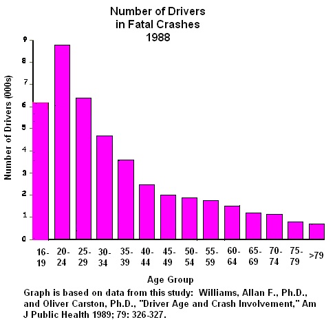
1.  The following statistics suggest that 16-year-olds are safer drivers than people in their twenties, and that octogenarians are very safe.  Is this true?
Solution:  No.  As the following graph shows, the reason 16-year-old and octogenarians appear to be safe drivers is that they don't drive nearly as much as people in other age groups. 

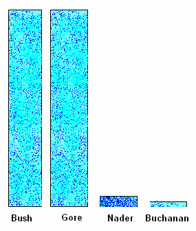
2.  On November 13, 2000, Newsweek published the following poll results:
Since 9% said that Nader was the only candidate worth voting for, one would have expected him to get at least 9% of the vote in the 2000 election.  He only got about 3%.  What happened?
Solution:
There was a biased statistic because the sample wasn't randomly drawn from the population.  A disproportionate number of Nader supporters participated in the poll in order to make him appear more viable as a candidate.
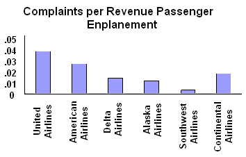
3.  Consider these complaints about airlines published in US News and World Report on February 5, 2001:
Can we conclude that United, American, and Delta are the worst airlines and Alaska, Southwest, and Continental are the best? Solution:  No.  The airlines that had the most complaints also had the most passengers.  As the following graph shows, rates and percentages are often more informative than raw numbers.
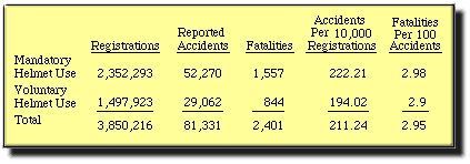
4.  The following statistics about motorcycle helmet use seem to suggest that helmets cause more injuries and fatalities.  Is it really safer to go without helmets?
Source:   Motorcycle Statistical Annual, Motorcycle Industry Council, Inc., 1994, as reported on http://www.bikersrights.com/statistics/stats.html.
Solution:  Correlation doesn't prove causation.  The statistics suggest that helmets cause accidents and fatalities, but it's possible that a high number of motorcycle accidents and fatalities in high-risk states caused them to adopt mandatory helmet laws.  
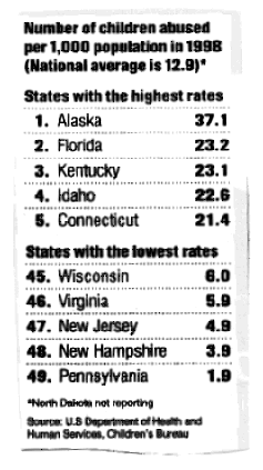
5.  This clipping from US News and World Report on 1/29/01 suggests that Alaskans are terrible parents.  Is this true?
Solution:  The difference in the abuse rates probably stems from different definitions for abuse in the various states.  For example, Alaska (the "worst" state) says that a child is abused if his or her health or welfare is harmed or threatened.  Pennsylvania (the "best" state) defines it as a recent act or failure to act.
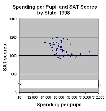
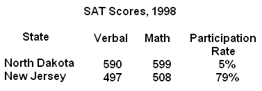
6.  Columnist George Will wrote in the Washington Post in 1993 that  "... the 10 states with the lowest per pupil spending included four — North Dakota, South Dakota, Tennessee, Utah — among the 10 states with the top SAT scores ... New Jersey has the highest per pupil expenditures, an astonishing $10,561… [Its] rank regarding SAT scores? Thirty-ninth." 
This negative correlation between spending per pupil and SAT performance seems to be borne out by this graph:
And by this one:
Does this mean that spending more on education makes students worse off?
Solution:  The results are more likely due to differing SAT participation rates in the states (Colleges in North Dakota and other states require the ACT rather than the SAT for college admissions).  The students who take the SAT in North Dakota include many who plan to apply to elite out-of-state colleges.
This caused a sampling bias, since the sample wasn't representative of the population.
7.   Researchers (Arthur Kellermann et. al., "Gun Ownership as a Risk Factor for Homicide in the Home," The New England Journal of Medicine, October 7, 1993, pp. 1084-1091), found that gun owners are 2.7 times more likely to be murdered than non-owners.  Does this mean it's safer to not have guns in the house?
Solution:  Perhaps, but correlation does not imply causation.  It may be true that guns cause murders, but it might also be true that having a greater risk of being murdered causes people to own guns.
8.  "The best public schools offer a more challenging curriculum than most private schools."  Are public schools therefore better than private schools?
Solution:  We're being asked to compare apples with oranges:  the best public schools versus most private schools.
9.  "Fluoride consumption by human beings increases the general cancer death rate.   ….  [P]eople in fluoridated areas have a higher cancer death rate than those in non-fluoridated areas."  Should fluoridation be prohibited?
Solution:  Affluent areas are more likely to have fluoridation and they're also more likely to have older populations who are more likely to get cancer.
10.  Can we conclude from the following diagram that it's safer to drive while under the influence?
 
Solution:  No.  Drunk drivers have a fatality risk 7.66 times the norm, while non-drunk drivers have a risk only about .6 of the norm.  Only a very small percentage of drivers in New York City drive while under the influence, but they account for a disproportionate number of accidents.
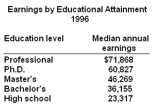
11.  The Monthly Labor Review published the following data, showing how earnings vary with education:
Can we conclude that getting a bachelor's degree will increase your earnings by almost $13,000 a year?
Solution:  Not necessarily.  Intelligence and drive also explain the differences in earnings, people with intelligence and drive are more likely to go to college.
12.  Allen Hershkowitz, senior scientist with the Natural Resources Defense Council, wrote that "a  well-run curbside recycling program can cost anywhere from $50 to more than $150 per ton of materials collected. Typical trash collection and disposal programs, on the other hand, cost anywhere from $70 to more than $200 per ton."  Does recycling save money?
Solution:  Hershkowitz asks us to compare apples with oranges:  a well-run curbside recycling program with typical trash collection and disposal programs.


© Lori Alden, 2005-7.  All rights reserved.  You may download the content, provided you only use the content for your own personal, non-commercial use.  Lori Alden reserves complete title and full intellectual property rights in any content you download from this web site. Except as noted above, any other use, including the reproduction, modification, distribution, transmission, republication, display, or performance, of the content on this site is strictly prohibited.

source: http://www.econoclass.com

About Crime Statistics


When crimes such as burglaries, robberies or homicides are reported, this information goes into statistical databases that are utilized for a number of purposes. Crime statistics are often used to measure the safety of a specific area such as a neighborhood, city, state or nation. Crime statistics also help law enforcement officials set planning and budgeting priorities. In addition, lawmakers rely on these figures in setting sentencing guidelines and devising programs to aid crime victims.
  1. Function

    • In order to better understand and control crime, accurate counts of its occurrence are needed. Crime statistics represent the recorded incidence of criminal behavior. These figures are typically compiled as uniform data on offenses and offenders derived from records of criminal justice agencies. Official crime statistics are published annually or periodically in relatively standard formats. The federal government's Bureau of Justice Statistics is the primary source of crime statistics in the United States.

    History

    • Crime statistic collection emerged in the early 19th century to measure whether criminal activity in certain areas was increasing or decreasing. France began systematically collecting national judicial statistics on prosecutions and convictions in 1825. Beginning in 1857, Great Britain was the first nation to systematically collect police data. In 1920, American criminologist August Vollmer proposed a national bureau of criminal records. The International Association of Chiefs of Police acted on this suggestion in 1927 by developing a plan for a national system of police statistics that would include known offenses and arrests collected from local police departments in each state. The Federal Bureau of Investigation became the clearinghouse for these statistics and published the first of its now-annual Uniform Crime Reports in 1931.
      To meet a growing need for more flexible, in-depth data, the FBI has supplemented its Uniform Crime Reports in recent years with what's known as the National Incident-Based Reporting System. Another relatively new wrinkle is the National Crime Victimization Survey, which collects data on the frequency, characteristics and consequences of criminal victimization from a nationally representative sample of 76,000 households.

    Types

    • The most frequently referenced classifications of criminal statistics are violent crimes and property crimes. Violent crimes include homicide, rape, robbery and assault. Property crimes consist of burglaries, thefts and motor vehicle thefts.

    Time Frame

    • During 2007, an estimated 1.4 million violent crimes occurred in the United States, according to the FBI's Uniform Crime Reporting Program. This total represented a .7 percent decrease from the prior year. Aggravated assault was the most commonly reported violent crime, accounting for nearly 61 percent of the overall tally.
      Also in 2007, there were an estimated 9.8 million property crime offenses in the United States., which was 1.4 percent less than 2006. The 2007 property crime total resulted in an estimated $17.6 billion in losses.

    Prevention/Solution

    • One goal of gathering and publishing crime statistics is to determine where offenses are taking place so officials can take action to combat the problem. Crime statistics may prompt police to increase patrols in specific crime-prone areas. The same statistics also might lead government agencies to offer tax incentives to businesses in hopes of creating more commerce and providing additional jobs in these areas as a deterrent to crime.
Source: www.ehow.com

Rabu, 06 April 2011

Is GDP An Obsolete Measure of Progress?

Seperti judulnya, pertanyaan inilah yang akan dijawab dalam artikel ini. Ada ukuran lain, selain GDP (PDB) atau usia harapan hidup, yang lebih dapat mendeskripsikan ukuran kemakmuran suatu negara, yaitu Happy Planet Index (HPI) atau mungkin kita lebih familiar dengan istilah Indeks Kebahagiaan. HPI mengkombinasikan metrik ekonomi dengan ukuran-ukuran lain yang bersifat subjektif, seperti kepuasan hidup. Pada tahun 2007 perusahaan riset Frontier telah melakukan metode riset ini. Metode ini sangat masuk akal dan tentu saja tidak dapat dipungkiri, karena apa artinya jika secara angka pertumbuhan ekonomi meningkat, tetapi setiap warga negara tidak merasa aman di negaranya sendiri. Apa artinya jika rata-rata usia harapan hidup di suatu negara meningkat, tetapi selama masa hidupnya itu mereka tidak menikmati kehidupannya. Karena itu, sudah semestinya data-data pemerintah didukung oleh data kualitatif untuk melengkapi data kuantitatif, yang tentunya menunjang dalam pengambilan keputusan. Perhitungannya? Sangat yakin kalau analisa statistik yang digunakan, tentunya akan berbicara lebih.


Chris Hondros / Getty
Since last summer the nation's Gross Domestic Product (GDP) has gone up — indeed, it grew at a surprising 5.7% rate in the 4th quarter — seeming to confirm what we've been hearing: the recession is officially over. But wait — foreclosure and unemployment rates remain high, and food banks are seeing record demand. Could it be that the GDP, that gold standard of economic data, might not be the best way to gauge a nation's relative prosperity?

Since it became the prime economic indicator during the Second World War (to monitor war production) many have criticized policy-makers' reliance on the GDP — and proposed substitute measures. For example, there is the Human Development Index (HDI), used by the UN's Development Programme, which considers life expectancy and literacy as well as standard of living as determined by GDP. And the Genuine Progress Indicator, which incorporates aspects of social welfare such as income equity, pollution, and access to health care. In the international community, perhaps the biggest nudge has come from French President Nicolas Sarkozy, who commissioned a report by marquee-name economists, including Nobel laureates Joseph Stiglitz and Amartya Sen, to find alternatives to what he calls "GDP fetishism".